
In today’s digital age, having an online presence is essential for businesses of all sizes. However, merely having a website is no longer sufficient. With the rapid growth of mobile internet usage, ensuring your website is mobile-friendly has become necessary. This is where responsive design comes into play.
What is Responsive Design?
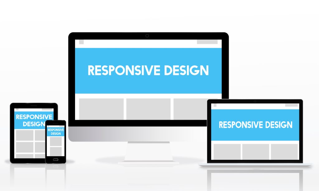
Responsive design refers to a web development approach that ensures a website adapts seamlessly to different screen sizes and devices. Whether your audience is browsing on a smartphone, tablet, laptop, or desktop, a responsive website provides an optimal viewing and interaction experience.
Why Mobile-Friendly Websites Matter
- Increased Mobile Usage Studies show that over half of global web traffic comes from mobile devices. People use their smartphones for everything from shopping to reading the news, and if your website isn’t optimized for mobile, you risk losing a significant portion of your audience.
- Improved User Experience A responsive website eliminates the need for pinching, zooming, or horizontal scrolling, which can frustrate users. A positive user experience not only keeps visitors on your site longer but also increases the likelihood of conversions.
- Higher Search Engine Rankings Search engines like Google prioritize mobile-friendly websites in their rankings. Google’s mobile-first indexing means that the mobile version of your site is considered the primary version when determining your search engine rank. A responsive design can help improve your SEO performance.
- Cost-Effective Solution Maintaining separate desktop and mobile websites can be expensive and time-consuming. Responsive design allows you to manage one site that works seamlessly across all devices, saving time and resources.
- Future-Proofing Your Website Technology evolves rapidly, and new devices with varying screen sizes are constantly being introduced. A responsive website is designed to adapt to these changes, ensuring your site remains functional and visually appealing over time.
Key Features of a Responsive Website
➤ Mobile-Friendly Design
A responsive website automatically adjusts its layout to fit the screen size of the user’s device. Whether it’s a smartphone, tablet, or desktop, the site’s design remains functional and aesthetically pleasing. This not only enhances user experience but also aligns with Google’s mobile-first indexing policy, which prioritizes mobile-friendly websites in search rankings.
➤ Fluid Grid Layouts
Fluid grid layouts are the backbone of responsive design. Instead of using fixed-width layouts, a fluid grid divides the webpage into flexible columns that resize proportionally based on the screen size. This ensures that content, images, and navigation elements scale perfectly, regardless of the device.
➤ Flexible Images and Media
Images and videos on a responsive website are designed to scale without losing quality. This is achieved through CSS techniques like max-width and height adjustments, ensuring that media elements adapt smoothly to different screen resolutions.
➤ Optimized Navigation
Navigation is a critical component of any website. Responsive websites employ features like collapsible menus, hamburger icons, or dropdowns for smaller screens, making it easy for users to browse without frustration. Intuitive navigation enhances user engagement and reduces bounce rates.
➤ Fast Loading Times
Speed is a significant factor in user satisfaction and SEO. Responsive websites are often optimized for faster loading by compressing images, leveraging browser caching, and minimizing unnecessary scripts. Faster websites provide a better user experience and improve search engine rankings.
➤ Touch-Friendly Elements
Responsive websites are built with touch interfaces in mind. Buttons, links, and other interactive elements are appropriately sized and spaced to accommodate finger taps. This is especially important for mobile users, ensuring a frustration-free browsing experience.
➤ Consistent User Experience
A responsive design ensures a consistent look and feel across devices. Branding elements, typography, and color schemes remain uniform, reinforcing brand identity and credibility.
➤ SEO Benefits
Search engines favor responsive websites because they provide a better user experience. A single, responsive site eliminates the need for separate mobile and desktop versions, simplifying content management and preventing duplicate content issues. This unified approach improves your site’s search engine visibility.
➤ Future-Proofing
As new devices and screen sizes emerge, responsive design ensures that your website remains accessible and functional. By focusing on flexibility and adaptability, responsive websites are better equipped to handle future technological changes.
How to Implement Responsive Design
⇄ Understand the Basics of Responsive Design
Responsive design is about creating websites that adapt to different screen sizes using CSS media queries, flexible grids, and flexible images. The goal is to ensure that the layout and content scale appropriately on various devices, including desktops, tablets, and smartphones. Key components include:
- Fluid Grid Layouts: Instead of fixed widths, use percentages or view widths to define grid column sizes.
- Flexible Images: Ensure images resize automatically by setting max-width to 100% and applying CSS rules like object-fit to prevent distortion.
- Media Queries: Use CSS media queries to apply different styles based on the screen size. For example, use different fonts, padding, or display settings for mobile screens.
⇄ Planning Your Design
Before diving into the implementation, it’s essential to plan how your responsive design will behave on different devices. Consider:
- Content Prioritization: On mobile devices, prioritize content that is most relevant to users. For instance, contact forms, key product features, or services should be easily accessible.
- Navigation: Simplify navigation menus for smaller screens by using drop-downs or hamburger menus. The goal is to keep navigation intuitive and easy to use.
- Images and Media: Optimize images and media for mobile by compressing them and using responsive formats. Avoid heavy media files that could slow down the loading time.
⇄ Use a Responsive Framework
Consider using a responsive framework like Bootstrap, Foundation, or Tailwind CSS. These frameworks provide pre-designed grids, CSS classes, and components that make it easier to create a responsive layout without starting from scratch. They offer built-in responsiveness and can save you a significant amount of time in development.
⇄ Test Across Devices
Testing is a critical part of the responsive design process. Here’s how to do it:
- Emulators and Simulator Tools: Use browser developer tools to simulate different devices and screen sizes. Tools like Chrome DevTools, Firefox Developer Tools, or online tools like BrowserStack can be invaluable.
- Real-World Testing: If possible, test your design on real devices to catch issues that might not appear in emulators. Use a mix of devices (different brands, OS versions) to get a comprehensive view.
- Cross-Browser Testing: Test your design on various browsers to ensure compatibility across platforms. Browsers like Chrome, Firefox, Safari, and Edge may render the layout differently, so adjustments might be necessary.
⇄ Optimizing Performance
Responsive design is not just about layout; it’s also about performance. Optimize images, minimize CSS and JavaScript files, and use tools like Web Vitals or Google PageSpeed Insights to monitor and improve site speed. A fast-loading site is not only better for SEO but also enhances the user experience.
⇄ Make Use of Analytics
Use web analytics tools to track how users are interacting with your responsive design. Metrics like bounce rates, session durations, and conversion rates will help you understand if the design is effective across different devices. Adjustments can then be made based on real-world data to improve user experience and business goals.
⇄ Keep Updating and Iterating
Responsive design is not a one-time task. As new devices and screen sizes emerge, you will need to make adjustments. Regularly review and iterate on your design to ensure it remains functional and visually appealing across all devices.
Conclusion
A mobile-friendly website is no longer a luxury; it’s a necessity. Responsive design improves user experience boosts SEO and ensures your website remains relevant in an increasingly mobile world. Investing in responsive design is an investment in your brand’s future, helping you reach a broader audience and stay ahead of the competition.
Don’t let an outdated, unresponsive website hold your business back. Embrace responsive design today and set the stage for online success.
WebXPTS is a leading website design agency in Dubai, specializing in creating responsive website designs tailored to meet the diverse needs of businesses in the region. They focus on delivering dynamic and visually appealing websites that adapt seamlessly to different devices, ensuring an optimal user experience across desktops, tablets, and smartphones. With a team of skilled designers and developers, WebXPTS combines creativity with technical expertise to craft responsive solutions that enhance brand visibility, engagement, and conversion rates. Their goal is to help businesses stay competitive in the digital landscape by providing flexible, user-friendly websites that cater to an increasingly mobile audience.